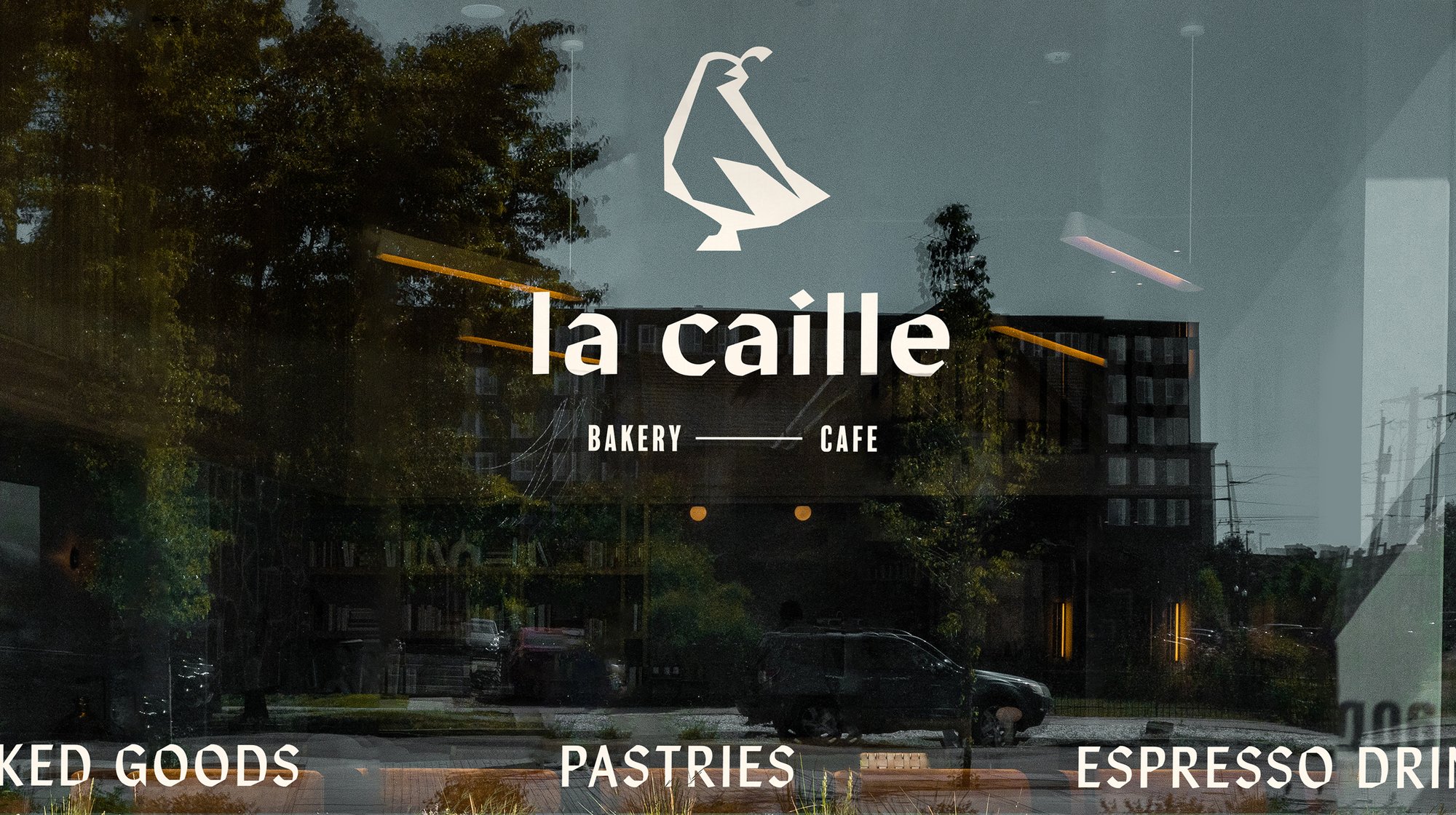
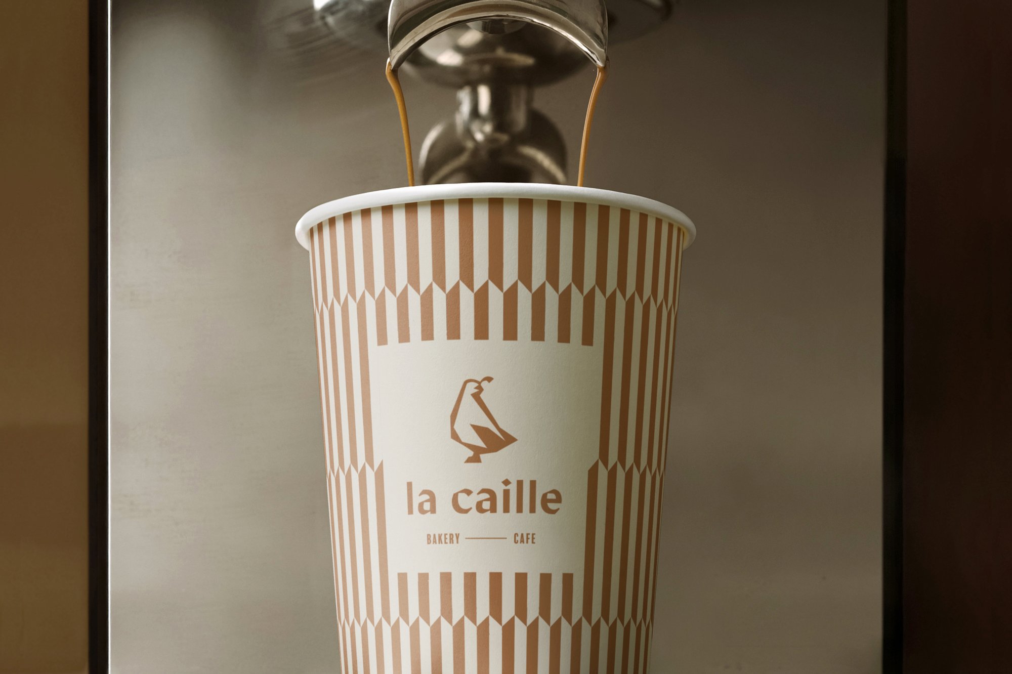
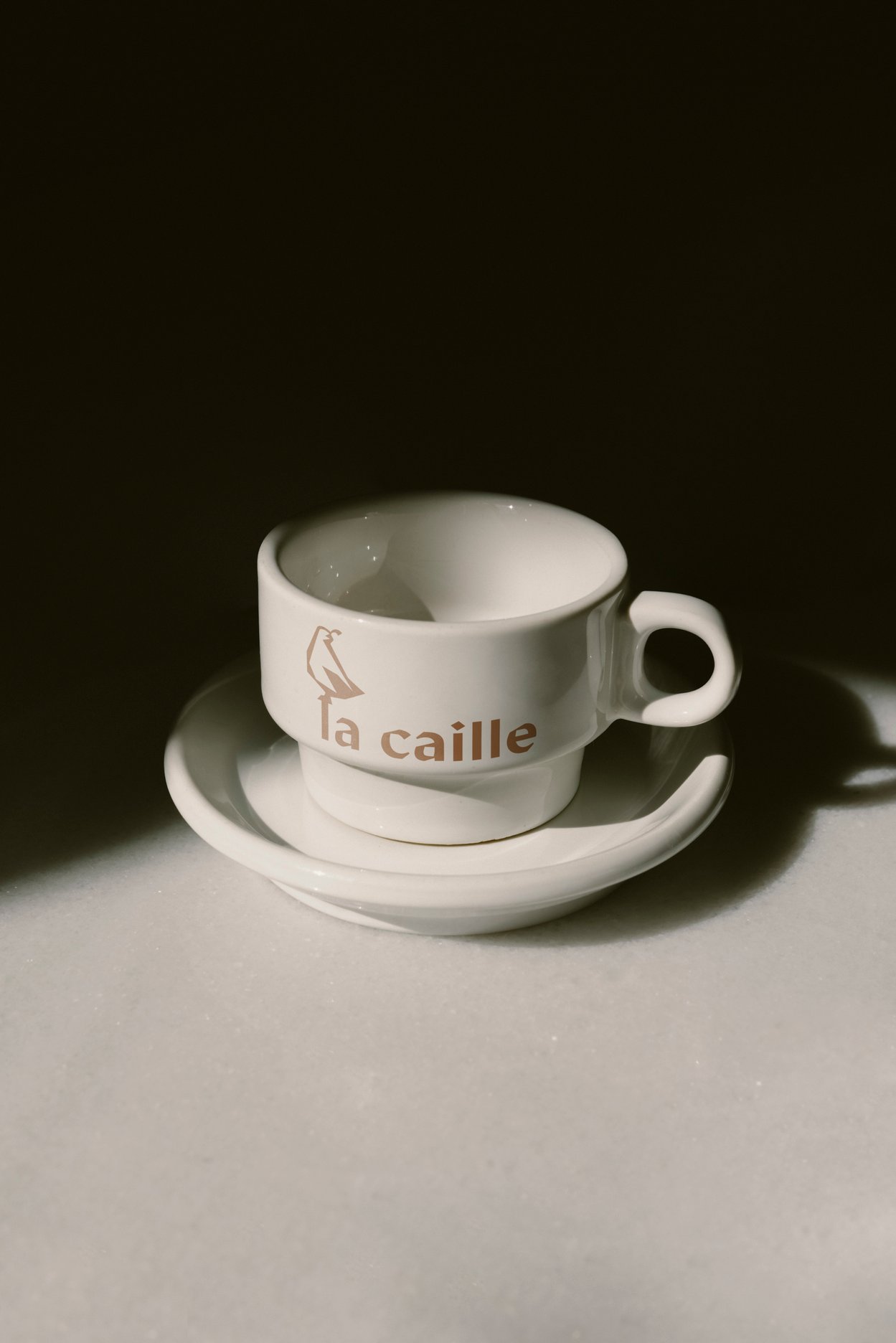
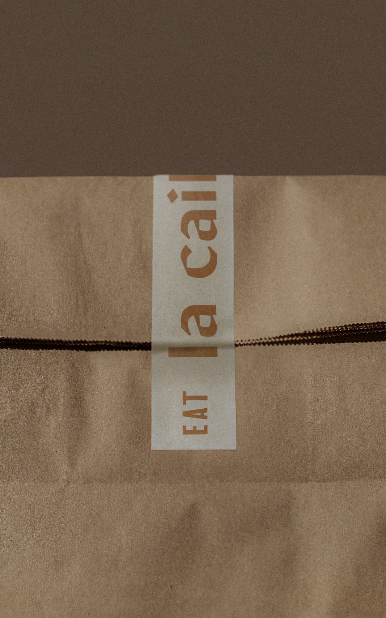
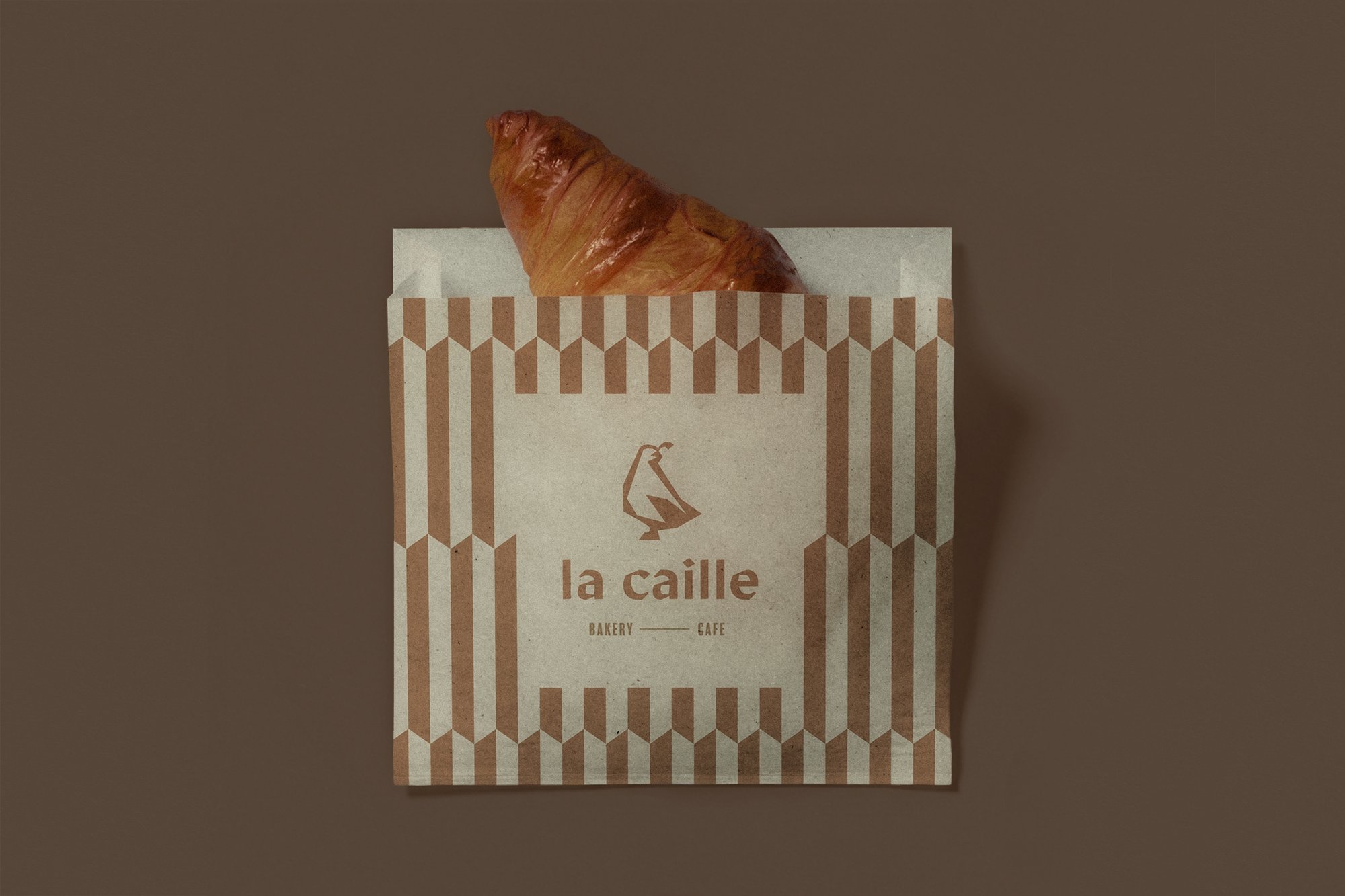
Founded on the belief that family recipes are meant to be shared, La Caille serves fresh baked goods, seasonal espresso drinks, and lunch specials that rotate weekly. Family, quality, and reliability are its cornerstone values, personified in the symbol of its tiny but mighty bakery: la caille (French for quail). In contrast to its legacy as a multi-generation local business, La Caille is also incredibly contemporary, with modern furniture, trendy menu items, and a playlist comprised of alternative favorites.
These values are central to the identity we created for La Caille. Combining modern, punchy typography with a color palette reminiscent of coffee beans, wheat flour, and caramel, the branding is both warm and memorable.